

Stressing Losing Leads Because of Your Website?
Many construction companies across the U.S. are still running on websites built between 2010 and 2018—those “set it and forget it” sites that seemed good enough at the time but now quietly leak leads every single day. Maybe it was a DIY project on a free template. Maybe a nephew “knew computers.” Either way, that outdated website is now costing you money while you’re too busy on the jobsite to notice.
Here’s the thing: construction websites aren’t just an online brochure anymore. It’s your 24/7 project manager, estimator, and recruiter. When potential clients search “roofing contractor near me” at 9 p.m., your site is the one answering the phone. When a commercial developer vets subcontractors before sending an RFP, your digital presence speaks for you. When skilled tradespeople look for their next employer, your careers page—or lack of one—tells them whether you’re worth the application.
Stop stressing about your next lead. If your site loads slow, looks like 2012 on a phone, or hides your best completed projects behind three clicks and a broken menu, you’re already losing to the shop down the street. The competition doesn’t need to be better at the actual work. They just need a website that makes them look like they are.
This article tackles the top website design mistakes specific to contractors—general contractors, roofers, HVAC companies, plumbers, electricians, remodelers, concrete crews, metal building erectors, and everyone else who actually builds things. We’ll cover both residential and commercial scenarios because many construction websites try to serve both audiences and end up serving neither.
At RSM Marketing, we’ve been a Kansas City–based, construction-focused digital marketing partner since 2010. We build and manage contractor websites, SEO, ads, content, reputation, and more on an ongoing basis. We’re not a generic agency that also does restaurants and dentists. Hot tar smells like money to us too.
1. Playing “Guess Who” With the Wrong Audience
Picture this: A suburban homeowner in Atlanta needs a new roof after a hailstorm. She finds your website. The homepage shows a tilt-up warehouse, talks about “precon coordination,” and mentions your bonding capacity. She’s confused. She leaves. Meanwhile, a commercial property manager in the heart of ATL lands on your site looking for a contractor to handle tenant improvements across his portfolio. He sees “We treat every home like our own!” and photos of kitchen remodels. He assumes you’re too small for his needs. He leaves too.
Many construction websites don’t clearly choose their target audience—residential vs. commercial, homeowner vs. GC vs. architect, service calls vs. bid support. The result? Unqualified calls, or worse, no calls at all. When you try to speak to everyone, you connect with no one.
Residential homeowners want fast trust signals. They’re looking for:
- Before/after photos of projects like theirs
- Client testimonials and star ratings
- Financing options
- Emergency service availability
- A phone number they can tap immediately
Commercial developers and facility managers care about different things:
- Safety records and EMR ratings
- Bonding capacity and insurance certificates
- Project schedules and milestone tracking
- Multi-state or regional capabilities
- References from similar sectors (healthcare, industrial, retail)
Your website’s words matter. On homeowner-facing service pages, ditch the internal jargon. Nobody searching “roof leak repair” wants to read about “RFIs” and “AHJs.” Save the technical language for your commercial and spec/bid pages where it actually builds credibility.
Example Hero Messages:
| Residential Remodeling | Commercial Design-Build |
|---|---|
| “Transform Your Kansas City Home—From Concept to Keys” | “Reliable Design-Build Partner for Industrial & Commercial Projects Across the Midwest” |
| Focus: Trust, beauty, timeline, budget | Focus: Capability, safety, schedule, scale |
How to Fix Misaligned Targeting
Start with a simple exercise. Grab a notepad and list your top 3 ideal clients. Be specific:
- “Kansas City homeowners planning $50K+ kitchen or bath remodels”
- “Property managers with 10+ commercial buildings needing ongoing maintenance”
- “Industrial plant engineers in Wichita looking for concrete and steel contractors”
Now look at your homepage. Does it speak to any of those people specifically? Or does it try to speak to all of them and end up speaking to none?
Here’s how to fix it:
- Create separate navigation paths. Instead of one generic “What We Do” page, build clearly labeled sections: “Residential Services” and “Commercial Services.” Let visitors self-select immediately.
- Use different case studies for different audiences. An HOA roofing project and a downtown office tenant improvement are completely different stories. Put them on the relevant pages where the right audience will find them.
- Pull real quotes from real clients. Before touching your site’s layout or design, review 10–20 of your best recent jobs. What did those clients actually say? Use their words in your headlines and FAQs.
- Interview your own team. Your estimators, PMs, and salespeople know the questions clients always ask. Those questions should drive your content structure.
At RSM Marketing, we “get your knowledge out of your head and onto your website.” We interview owners, project managers, and estimators, then write copy that sounds like them—not like a robot or a marketing textbook.
2. DIY Design Disasters That Make You Look Like You Cut Corners
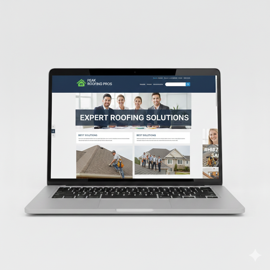
DIY sites built in 2015 have a certain look. You know it when you see it:
- Stretched logos that look like they went through a taffy pull
- Blurry photos from old phones
- Eight different fonts fighting for attention
- Neon color combinations that hurt the eyes
- Homepages crammed with so many elements there’s no white space left to breathe
Builders obsess over straight lines, tight joints, and punch list details. But when your website looks like a rushed weekend side project, all that craftsmanship credibility disappears. Online users make snap judgments. Research shows 42% of visitors will leave a site due to poor functionality and 38% will bounce because of unattractive design.
For commercial GCs, facility managers, and lenders, this matters even more. They often vet contractors online before returning calls. Amateur web design can quietly kill RFP invites before you even knew you were being considered.
Before/After Examples:
| DIY Disaster | Professional Fix |
|---|---|
| Navigation menu crammed with 12 items, some with dropdowns 5 levels deep | Clean top nav with 5 items and a clear “Request a Bid” button |
| Homepage with auto-playing music, flashing text, and a visitor counter | Hero image of a signature project with a single focused headline |
| “About Us” page that’s one dense paragraph copied from a 2008 brochure | Story-driven page with team photos, company timeline, and core values |
How to Upgrade From DIY to Professional
The fix isn’t just hiring any web designer. It’s hiring one who understands the construction industry.
A generic “we do everything” agency doesn’t know the difference between a TPO reroof and a standing seam installation. They don’t understand why bonding capacity matters to a commercial client or why “free estimates” needs to be above the fold for residential.
Good web design for contractors means:
- Consistent brand color palette that reflects your company, not a random template
- Legible typography that works on screens of all sizes
- Clear visual hierarchy that guides users from headline to CTA
- Intentional white space that lets content breathe instead of overwhelming visitors
Key design elements every contractor site needs:
- Sticky header with phone number and “Request Estimate” button
- Clear service tiles that show what you actually do
- Trust badges: licenses, union affiliations, manufacturer certifications
- Safety and insurance information (especially for commercial)
Remember, a professional build should also account for speed, security, search engine optimization, and analytics—not just aesthetics. Nothing’s more expensive than trying to save money with a cheap site that doesn’t convert.
At RSM Marketing, we don’t just launch a site and disappear. We keep going, keep producing fresh content, and keep tuning site’s performance while you’re busy running crews.
3. Forgetting About Phone Users
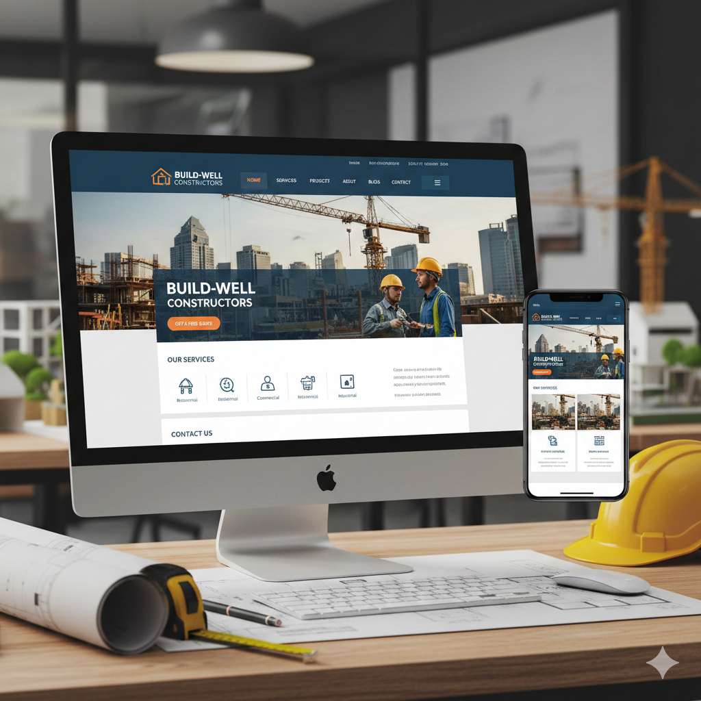
In 2024, more than 60% of website traffic comes from mobile devices. Think about who’s actually visiting your site:
- Homeowners on the couch at 9 p.m. after noticing a leak
- Superintendents standing in a muddy laydown yard, phone in hand
- Facility managers walking a roof, comparing contractor options
- Property developers reviewing portfolios between meetings
These people aren’t sitting at desks with big monitors. They’re on phones with cracked screens and spotty cell service. If your site doesn’t work for them, you’ve lost them.
What bad mobile experiences look like for contractors:
- Menus that don’t open or require pinch-zooming to tap
- Buttons smaller than a fingertip (they should be at least 48×48 pixels)
- Pop-ups that block the entire screen and can’t be dismissed
- Photo galleries that take forever on cell data
- Forms that don’t resize or support autofill
Google uses mobile-first indexing, which means it primarily looks at the mobile version of your site for ranking purposes. A clunky mobile experience can tank your search results even if your desktop view looks great.
For trades where urgency matters—emergency plumbing, HVAC no-heat calls, storm damage roofing, fire and flood restoration—mobile usability isn’t optional. It’s the difference between getting the call and losing it to a competitor with a tap-to-call button.
Mobile Experience Comparison:
| Frustrating User Experience | Seamless User Experience |
|---|---|
| Phone number buried at the bottom | Click-to-call button in sticky header |
| Quote form with 15 required fields | Short form: name, phone, describe your project |
| Portfolio images that won’t load | Compressed high quality images that load in under 2 seconds |
| No way to text the company | “Text Us” button for quick questions |
Mobile-First Fixes for Contractors
Responsive web design isn’t a luxury—it’s the baseline. Your site should adapt its layout, navigation, and images across phones, tablets, and desktops without needing a separate “m.site” version.
For residential emergency services, prioritize:
- Click-to-call buttons above the fold
- “Request Service” forms that take 30 seconds to complete
- Location maps showing your service area
- Clear messaging: “We’re available 24/7 for emergencies”
For commercial work viewed on mobile:
- Lead with your project portfolio and key sectors served
- Highlight safety program credentials and certifications
- Feature key personnel with contact info
- Keep marketing paragraphs short—busy PMs don’t have time for fluff
One-tap features that enhance user engagement:
- “Call Now” button
- “Text Us” option
- Short quote request forms
- Directions to your office or shop
At RSM Marketing, we test every new build on multiple mobile devices and screen sizes. And we don’t stop at launch—we monitor ongoing performance to catch issues before they cost you leads.
4. Boring, Overloaded, or Confusing Content That Puts Visitors to Sleep
Many construction websites swing between two content extremes, and both drive visitors engaged less than they should be:
Extreme #1: Walls of dense, technical text Copied straight from proposals and RFP responses. Full of acronyms. Zero personality. Reads like a government filing.
Extreme #2: Thin, generic fluff “We do quality work.” “Customer satisfaction is our priority.” “Serving the area for over 25 years.” Says nothing. Means nothing. Convinces no one.
Both homeowners and commercial buyers scan web pages first. If they can’t see what you do, where you work, and why you’re different within 5–7 seconds, they bounce. Your prospective clients don’t read—they skim.
Common content sins on construction websites:
- Outdated copy (“serving the area for 25 years” with no founding date—is that from 1999 or 2020?)
- Mixed tenses (“we will complete the project in 2019”)
- No mention of actual project sizes, timelines, or sectors served
- Jargon without explanation (“tenant finish,” “TPO,” “design-build” with no context)
- Service pages that describe everything and specialize in nothing
Your website’s structure should guide users toward what they need. Short paragraphs. Bullets. Photos breaking up text. FAQs gathered from what your estimators and salespeople actually hear.
Writing Construction Content That Actually Converts
Instead of one overloaded “Services” page, create separate service pages for each major revenue line:
- Commercial Roofing
- Residential Roofing
- Industrial Concrete
- Custom Home Building
- Tenant Improvements
- HVAC Installation & Service
Each page should include real numbers and details:
- Project square footage ranges
- Typical budget ranges (even ballpark)
- Schedule duration for typical projects
- Specific regions or metros served
- Typical client types (municipalities, hospitals, multi-family REITs, homeowners)
Don’t just post pretty final photos. Weave in short project spotlights that show:
- The challenge (water infiltration, tight schedule, occupied building)
- Your solution (phased approach, custom flashing, night work)
- The outcome (project delivered on time, no leaks in 3 years, repeat client)
Include clear calls to action within the content itself—not just at the bottom:
- “Get your free roof inspection—we’ll be on-site within 48 hours.”
- “Send us your plans for a 48-hour bid review.”
- “Schedule a site visit to discuss your project.”
At RSM Marketing, we’re experts at extracting expertise. Bring us your pig—those messy job stories, bid notes, and field knowledge—and we’ll turn it into a prize-winning story your market actually understands.
5. Hiding Your Trophy Case: Weak Portfolios and Social Proof
Your project portfolio is your digital trophy case. For both residential and commercial construction, it’s the proof that you actually do what you say you do. If it’s missing, thin, or stuck in 2016, buyers assume you’re not doing much work—or worse, that you’re hiding something.
Common portfolio mistakes on many construction websites:
- Only one or two old projects (last updated 2017)
- Tiny, compressed photos that don’t showcase the work
- No project descriptions—just random images with no context
- No indication of whether you handle residential remodels, tilt-up warehouses, or municipal work
- Photos mixed together with no organization by service or sector
Different audiences need different proof:
- Homeowners love before/after galleries and reviews. They want to see transformations similar to what they’re imagining for their own home.
- Commercial clients want project types, sectors served, and stories about repeat clients. They’re evaluating capability and reliability.
- Subcontractors and potential hires check portfolios to judge the kind of work and job sizes you handle before deciding to apply.
A visually appealing portfolio uses large images, allows filtering by service or sector, and includes short summaries for each project. It’s not an unstructured photo dump—it’s curated evidence of your expertise.
Building a Portfolio That Sells and Recruits
Aim for at least 10–20 recent projects across your key services. Each project listing should include:
- Project location (city/region)
- Client type (homeowner, property manager, general contractor, municipality)
- Scope of work (brief description)
- Timeline (how long the project took)
- 3–6 strong photos (before, during, after)
If your construction business serves both residential and commercial markets, include examples from both—but label them clearly. Visitors should be able to filter or navigate to the projects site relevant to their needs.
Social proof amplifies your portfolio. Add testimonials, star ratings, and review snippets near portfolio items. Hot tar smells like money to you; reviews smell like success to your customers.
Don’t forget: your portfolio is also a recruiting tool. Add a “Work With Us” or “Careers” CTA near portfolio sections. Skilled tradespeople want to see the type of jobs and environments they’d be working in. Past projects tell that story better than any job description.
At RSM Marketing, we help gather project details, organize image libraries, write project descriptions, and keep portfolios updated—so your trophy case never goes stale.
Local SEO and Reputation for Construction Firms
Start by fully optimizing your Google Business Profile:
- Correct NAP (name, address, phone) matching your website exactly
- Accurate categories (e.g., “Roofing Contractor,” “General Contractor,” “HVAC Contractor”)
- Complete service area listings
- High-quality photos of projects, trucks, team members
- Regular posts about completed projects and company news
Create location and service pages that target specific metros and services:
- “Commercial HVAC in Overland Park”
- “Residential Remodeling in Lee’s Summit”
- “Industrial Roofing in Wichita”
One generic “Service Area” paragraph doesn’t cut it. Search engines and potential clients both want specificity.
Make review generation a deliberate process:
- Send follow-up emails after project completion
- Use QR codes on trucks, yard signs, and invoices
- Give techs and supers simple scripts to ask happy clients for Google reviews
RSM Marketing provides Local SEO and reputation management packages that keep profiles fresh, reviews coming in, and rankings climbing up the map pack. For regional or multi-state commercial contractors, we also target broader industry terms while supporting local office locations.
6. Weak SEO, Local Visibility, and Tracking: Building in the Dark
Many contractors invest in a new website but completely ignore search engine optimization (SEO) on contractor websites, local search, and analytics. The result? An expensive digital business card that no one can find unless they already know your name.
Here’s the reality: online experiences start with a search engine. If you’re not ranking for high-intent phrases like “roof replacement near me,” “commercial concrete contractor Kansas City,” or “office build-out contractor Overland Park,” you’re invisible to potential customers actively looking for what you do.
Both residential service-area businesses and commercial contractors rely heavily on:
- Google Business Profiles (formerly Google My Business)
- Map pack visibility (the top 3 local results with the map)
- Online reviews for credibility and trust signals
Common SEO mistakes on construction websites:
- No keyword strategy—just hoping the company name is enough
- Missing H1 headings and meta descriptions on web pages
- Slow loading pages that hurt rankings
- Unclaimed or inconsistent Google Business Profiles
- No tracking of phone calls or form submissions
Ignoring SEO is like building in the dark. You have no idea what’s working, what’s broken, or where your website traffic actually comes from. Get busy growing or get busy slowing—without ongoing optimization and tracking, there’s no way to know which marketing investments pay off.
Tracking, Analytics, and Data-Driven Decisions
You can’t improve what you don’t measure. Implement proper tracking from day one:
- Google Analytics 4 for website traffic and user behavior
- Google Tag Manager for event tracking without constant code changes
- Call tracking to attribute phone calls to specific marketing channels
Set up conversion goals tied to real business outcomes:
- “Request a Bid” form submissions
- “Schedule an Inspection” bookings
- “Apply for a Job” applications
- Track each by channel: organic, paid, social, email
Ignoring data is like building without a punch list. Small improvements—adjusting CTAs, rewriting headlines, simplifying form fields—can significantly enhance conversion rates. But you’ll never know what to fix if you’re not measuring.
RSM Marketing’s managed services include monthly reporting and proactive recommendations. We don’t leave contractors tired of always coming up with what to do next. We bring the ideas and the execution.
We don’t “set it and forget it.” We actively watch the numbers and keep adjusting campaigns and content even when you’re too busy to meet.
7. Slow, Clunky, and Insecure Sites That Drive Good Clients Away

A slow website is a broken website. And in construction, broken doesn’t fly.
Speed problems usually come from:
- Oversized photos (that 5MB image from your phone doesn’t need to be 5MB on your website)
- Cheap shared hosting that can’t handle media-heavy pages
- Old themes and page builders bloated with unnecessary code
- Too many plugins fighting with each other
The data is clear: online users start abandoning sites heavily after 3 seconds. Sites that load in 1 second see three times more conversions than those taking 5 seconds. For a residential homeowner searching “emergency plumber” or a facility manager comparing contractors on their phone, every second matters.
Security is equally critical. Many contractor sites lack:
- SSL certificates (that “https” and padlock icon)
- Visible privacy policies
- Basic security updates and maintenance
For sophisticated commercial buyers and IT departments, a “Not Secure” browser warning is an instant red flag. Commercial and public-sector work often requires vendors to demonstrate basic cyber hygiene. Your site’s performance and security speak to your professionalism before you ever shake hands.
Think of speed and security like building to code. They’re not “nice to have”—they’re table stakes for a well designed website.
Improving Performance and Security
Speed fixes:
- Compress and properly size images (especially those large galleries)
- Use modern image formats like WebP
- Limit auto-play videos on homepages
- Minimize plugins to only what’s necessary
- Upgrade to reliable hosting with good uptime and data centers near your markets
Security essentials:
- SSL certificate on every page (free through most hosts)
- Regular software, theme, and plugin updates
- Web application firewall
- Automated backups stored off-site
- Secure forms for collecting contact details and quote requests
Better performance also improves SEO rankings, which means more qualified visitors finding your site in the first place. Speed, security, and search visibility are all connected.
At RSM Marketing, we handle the technical heavy lifting—speed audits, performance tuning, security updates—so busy contractors don’t have to babysit their own servers.
8. Making It Hard to Call, Quote, or Hire You
This might be the simplest mistake on the list, and it’s still shockingly common: burying contact info, quote forms, and hiring links where no one can find them.
Serious prospects and job candidates shouldn’t have to hunt for how to reach you. Every extra click is a chance for them to give up and try your competitor instead.
Different audiences need different contact options:
- Residential visitors often want instant quote requests or one-tap calling
- Commercial contacts may prefer direct emails for estimators and project managers
- Job seekers need a clear path to open positions and an easy application process
Clear, persistent calls to action belong on every major page:
- “Request a Bid”
- “Schedule a Site Visit”
- “Get a Free Estimate”
- “View Open Positions”
Hiring and recruitment are now just as important as sales for most construction companies. A well designed site that ignores careers pages is missing a critical lever for business growth.
Effective CTA Placement:
| Page Type | Primary CTA | Secondary CTA |
|---|---|---|
| Homepage | “Request a Free Estimate” | “See Our Work” |
| Service Pages | “Get a Quote for [Service]” | “View [Service] Projects” |
| Portfolio | “Start Your Project” | “Join Our Team” |
| Blog Posts | “Schedule a Consultation” | “Get More Tips—Subscribe” |
| About Page | “Contact Us Today” | “View Open Positions” |
Designing Contact, Quote, and Careers Flows That Work
Make contact information impossible to miss:
- Phone number and email in the header (sticky on scroll)
- Primary CTA button always visible
- Full contact details on a dedicated “Contact” page
- Complete information repeated in the footer
Tailor your quote forms by audience:
- Homeowners: Short forms—name, phone, brief project description
- Commercial/industrial clients: More detailed RFQ-style forms with options to upload plans
- Separate forms for different services if needed
Build a robust “Careers” section that supports hiring and recruitment:
- Current job listings with clear descriptions
- Benefits and compensation highlights
- Company culture content and employee photos
- Easy application form (don’t require a resume upload for field positions)
At RSM Marketing, we use email automation and CRM integrations so quote requests and applications don’t disappear into inbox chaos. Sales follow-ups, workforce newsletters, and recruitment workflows keep both valuable leads and applicants warm—without manual chasing.
We help you hire right, the first time.
Don’t Just Deal With a Broken Website—Fix It
Let’s recap the common construction website design mistakes that quietly drain leads, bids, and hires:
- Wrong audience targeting — Trying to speak to everyone and connecting with no one
- DIY design disasters — Amateur visuals that undercut your craftsmanship reputation
- Poor mobile experience — Losing mobile users who can’t navigate or contact you
- Boring or overloaded content — Failing to communicate what you do and why it matters
- Weak portfolios and social proof — Hiding your best work instead of showcasing it
- Ignoring SEO and tracking — Building in the dark with no visibility or measurement
- Slow and insecure sites — Driving away good clients with poor user experience
- Buried CTAs and careers — Making it hard for prospects and candidates to reach you
You’re the kind of person who walks off a broken ankle to finish the job. But a broken website doesn’t just hurt—it quietly costs you bids, service calls, and hires every single week while you’re too busy to notice.
Get busy growing or get busy slowing. Website improvements aren’t cosmetic expenses—they’re strategic investments that compound over time through better rankings, more qualified web traffic, and a user friendly experience that converts visitors into customers and applicants.
At RSM Marketing, we’ve been a construction-focused digital marketing partner since 2010. We handle web design, SEO, local search, paid advertising, content, social media, email, and hiring support—so you can stay on the jobsite while your website works as your hardest-working foreman.
If you’re tired of a marketing company asking you what they should do, let’s talk.
We’ve got the plan, the tools, and the team to turn your website into a powerful marketing tool that generates leads around the clock. Bring us your pig—we’ll turn it into a prize-winning story for your market.